#4.0 - 4.1Transitions
4장에서는 고급 CSS를 배울 것이다. animation, transition, transformation 등
Transition : 어떤 상태에서 다른 상태로의 "변화"를 애니메이션으로 만드는 방법
* transition 속성은 state가 없는 요소에 붙여야 한다. → 애니메이션을 주고 싶은 요소가 state에 있어야 변화가 생긴다.
<style>
	a {
    	color: wheat;
        background-color: tomato;
        border-radius: 5px;
        transition: all 5s eas-in-out;
        }
	a:hover {
    	color: tomato;
        background-color: wheat;
        }
</style>
ease-in function : 브라우저에게 애니메이션이 어떻게 변화하는지 말해주는 것
- linear : 시작부터 끝까지 일정한 속도
- ease-in : 시작과 끝이 빠름
- ease-out : 시작과 끝이 느림
- ease-in-out : 시작이 빠르고 끝이 느림
<ease-in function 효과 사이트 ▽ >
https://matthewlein.com/tools/ceaser
Ceaser - CSS Easing Animation Tool - Matthew Lein
Choose an easing type and test it out with a few effects. If you don’t quite like the easing, grab a handle and fix it. When you’re happy, snag your code and off you go. Now that we can use CSS transitions in all the modern browsers, let’s make them
matthewlein.com
* all : 변화 요소를 한 번에 다룸.
>>각각 따로 다루고 싶으면 콤마(,)를 써서 여러 transition을 줄 수 있다.
#4.2 Transformations
Transformation: 말 그대로 한 요소를 변형(transform)시킬 수 있다.
**border-radius: 50% → 원이 된다.!!
예) transform: rotateX(n deg) → X축으로 n도 회전 (+Y / Z)
transform: sclaeX(n deg) → X축 기준으로 크기 변경
- transform은 box element를 변형시키지 않는다. 즉, 다른 형제 요소들에 영향을 끼치지 않는다.
- margin, padding이 적용되지 않는다. 일종의 3D이기 때문
- transform과 transition을 조합하여 더 멋진 애니메이션을 만들 수 있다.
<style>
      img {
        border: 5px solid black;
        border-radius: 50%;
        transition: transform 2s ease-in-out;
      }
      img:hover {
        transform: rotate(360deg) scale(1.5);
      }
</style>
#4.3 - 4.4 Animations
마우스를 올리거나, transition 없이 계속 재생되는 애니메이션을 만들기 위해서?
@keyframes 애니메이션이름 {
<!--어디에서부터 어디까지 애니메이션을 적용할지-->
from { }
to { }
}
<style>
      @keyframes thisisAnimation {
        from {
          transform: rotate(0deg);
        }
        to {
          transform: rotate(360deg);
        }
      }

      img {
        border: 5px solid black;
        border-radius: 50%;
        animation: thisisAnimation 5s ease-in-out;
      }
</style>
* animation: ... 끝에 infinite를 쓰면 애니메이션 무한 반복.
또는
@keyframes 애니메이션이름 {
0% { }
50% { }
100% { }
}
이처럼 from to 말고 1,2,3,4,5...10 혹은 0%, 25%, 50%, 75%, 100% 같이 여러 단계로 나누어 애니메이션을 만들 수 있다.
→ 애니메이션이 끝나면 다시 처음으로 돌아가지 않고, 계속 이어지도록 만들 수 있다.
#4.5 Media Queries
media query : 오직 CSS만을 이용해서 스크린의 사이즈를 알 수 있는 방법
@media screen and (max-width: n px) { }
min 사이즈와 max 사이즈를 조절하여 스크린 사이즈에 따라 스타일의 변화를 줄 수 있다.
<style>
@media screen and (max-width: 600px) {
div {
background-color: violet;
}
}
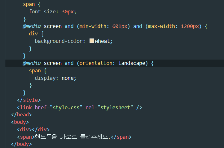
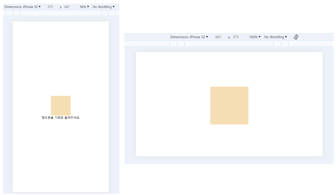
@media screen and (min-width: 601px) and (max-width: 1200px) {
div {
background-color: wheat;
}
}
@media screen and (min-width: 1200px) {
div {
background-color: hotpink;
}
}
</style>
@media screen에 (orientation: landscape | portrait) 을 추가하면 핸드폰이 가로모드인지 세로모드인지 구별할 수 있다.
*landscape = 가로, protrait = 세로
#4.6 Media Queries Recap
- media query 안에 원하는 모든 CSS를 작성할 수 있다.
- media query는 and를 써서 연결된다.
- "min-width"는 컴퓨터, 핸드폰 모두 적용되지만 "min-device-width"는 오직 핸드폰에만 적용된다.
- @media print를 이용하면 브라우저 인쇄 페이지에서의 속성을 변경할 수 있다.